Showing posts with label Colour. Show all posts

Thursday, 30 March 2017

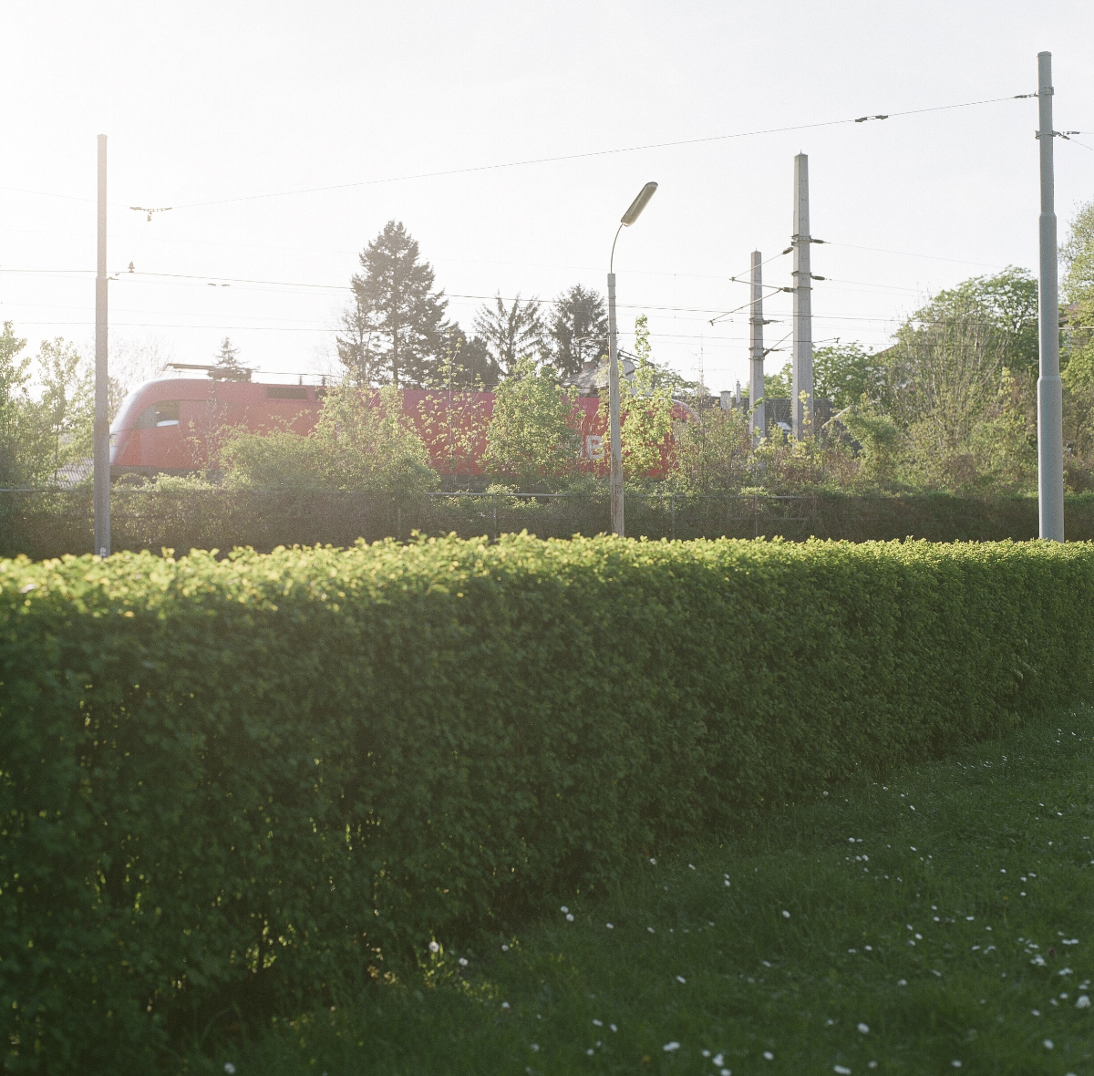
Urban Spring Jungle


Hello!

I guess this posting pictures my idea of Spring. a week in March 2017.


People heading home after work in the late afternoon sun.
Mid March and the light speaks cool colours. Warmer days are still to come, Kelvin-wise speaking.
After-work delight at "Bortolotti"
MaHü, the common place not far from the posh 1st district. First sunglasses have been spotted.
Wild garlic rush in the Vienna Woods, sunlight still reaching the gound. (Yes, we are still in Vienna).

These contrasting colours speak "joyous Spring" to me like no others: Y/B.
The public library has more to offer than just books. The stairs are one of the rare non-commercial urban public spaces in Vienna.
New company at the office: the Bumble Bee, chilling, waiting for the sun to show up ....
Ahhh! Warming up. Time to fly.

Enjoy the Spring-season!
Paula

Sunday, 29 January 2017

Analogue Blogging aka Memory Journaling


New year, new passion? 
Probably! 

Hello dear readers!

I am busy (yes, again), designing the foundation for future memories and it comes with a lot of paper. Nice paper of all kinds, countries, weights and colours. A playful, recently revived passion of mine. As far as I can remember, paper always brought joy. (*)

(*) The only time it did not bring a lot of joy was duing our hike to an acient paper mill in the middle of France on a hot summer day. We really did earn that visit. Lasting memories. 

Paper from Italy and England, companies with a long tradtion, dating back 200 years and more
 Playing around with various types of paper and  - also important - finding the favourite proportion.
Trimming notebooks to a preferred proportion

Approaching the right proportion. Which proportions do I enjoy? What proportions feels good in my hands? Which one is nice to look at?
 Prototyping:
The blue notebook to the left has a fine proportion for text & photos and allows a good amount of unused space on the pages. Inspiration: SZ DVD Edition. The grey notebook to the right has (almost) the proportion of the popular "Midori Traveller's Notebook". (the width of the Midori notebook measures ca +3mm)
Very much to my surprise the Midori-width is almost the Suhrkamp's pocketbook-width. Those pocketbooks do seem small, but they do hold a lot of words. Those books are a 20th century design icon. But with a width of 11cm, any 10cm-wide photos is likely to cram a page. I will stick with the proportion of the blue notebook. For now. :-)

Here I have been playing around with the trimming: flush trimming, overlapping covers ...


Now that I have build the foundation, I can move on to the next step, which is every bit as entertaining as the first one was: printing memories.

  
I will keep you posted!

Paula

Friday, 16 December 2016

Shortcut on Calligraphy

Hello again!

Well, this ended surprisingly early.

On my route to becoming a highly passionate calligraphista, I forgot one important detail : My left hand! Gothic lettering does not support people like me: Lefties. I can manage fountain pens almost worryfree (after some practice). But writing Gothic lettering with a nib that needs to be pulled from left to right in an exact angle of 40°? No way!

What to do? Become right handed in my mid 40's?
Learn a language that moves from right to left?

I opted for the third option and returned to the playground where passionate hobbyists like write with flexible nibs, no education or training needed.
"Tintenfaxi" was the breaking point where I quit Gothic lettering. (I thought the term Tintenfaxi is familiar in German, but I could not find a single entry online. Seems I was wrong! Tintifax it is - a character from  the Kasperl stage).

pictured above:
1st row: this was all I could write after an evening with the calligraphy nib, blame it on the left hand writing.
2nd row: writing with a flexible nib and black ink ("Pilot" = not the profession but the name of a Japanese Company which sells phantastic inks)
3rd row: Happyness comes with the flexible nib and black Pilot ink.
4th & 5th row: exploring the variations this flexbile nib offers

New adventures to come. Without lessons. Yes, all those lessons in the Calligraphy book did chase me off.

A simple flexible nib alreasy creates awsome results. All I have to do is: Write! The ink flows and so do my thoughts, which I bring to paper.

Black ink and a flexible nibs work as a phantastic trigger for writing/painting/drawing illustrations. I am surprised writing with a pen has not become a trend yet, with all those adorable illustrations surrounding us these days in magazine, on shop windows and online. My guess would be, that as soon as the ongoing hype "Colouring books for adults, mandalas etc" passes, illustrating will become really popular.

After all the excitement I chose to relax tonight and dedicated the evening to ... Christmas cards. No experiments. Simple watercolour.
Watercolour LOVE -  in capital letters.
Oh, I almost forgot: Yes, I did return the calligraphy-book. I bough envelopes instead. It's time to finally ship some cards.
Have a good night!
Paula


Saturday, 27 June 2015

Guided by a Girl

I don't know about your home towns, parks and squares, but in Vienna you find so called "Baulückenparks": former empty building lots, which have been transformed into parks – most of have been design in the 1980's and 90's.

The reason why I came to the park with my camera in the first place: 
the rooftop-structure reminds me of a boat in a dry dock.

Today I visited the park with my camera and it did not take long and I found company. I little girl, Katherina, joined me on my tour in the park. She happily pointed at scenic spots - spots she considered being worth being pictured, f.e. this blue colour on a wooden bench:

It is amazing, how good kids are at imitating. The girl had approached me and asked "Why do you take this picture?"

My answer: "I take this picture, because in my eyes, this is an interesting wall. The colour is beautiful, I like the blue and the yellow".

Not much later I found myself next to her, and listening to her words: "See, this is beautiful, I like this colour. Take a picture, it is a beautiful colour". Call her in :-)

Adult choice: The little girl was fond of the black and blue contrast.
 One rare, since not overly designed corner in a Viennese park

 Imagine Christo

 The structures you find in a park a useful. This stand provided an elevated angle, luxurious!

 Dogs everywhere ;-)

The girl's favourites:
No generation without Air Jordan. Haha!

There is a reason why I pictured only Katharina's hand and feet: She wanted me to take a photo of her, too. I explained to her, that I won't take a photo without her mother's or father's permission.


Btw, it is amazing how fast you can become friends with kids as soon as you slow down, they approach you. Taking your time is playful. We all play in our own way.

Looking at these photos, taken on a Saturday afternoon at 6pm, you see, there is almost nothing going on. Which is good! I appreciate this down time, in terms of sensations, because one week from today I am going to wake up in a different time zone, in a different climate, with a different language and uncommon places ... One word: Siberia.

Have a nice weekend!
Paula

Wednesday, 13 May 2015

The end of the line

Hello!

More squares to come! 

After having finishing the b/w film, I continued with a colour film.
The photos do reflect my approach to the location I pictured 100%. There is nothing exciting. 
You can sense a calm, almost boring atmosphere by looking at the photos. Guess what, that's exactly how it is, the end of the line. 
I am surprised, how soft the colours turned out. I guess I overexposed most of the pictures, maybe the handling of the film at the photo-laboratory did its part, too, altough the scans are much lighter than the original prints, the contrast is also very low.
 2nd photo not as intended ;-)

 
The 6x6 creates a unique feeling of space. When I look at the photo with the blossoms above, it seems like a picture taken inside a room. The only room that's there is the room formed by the branches of the tree.
On my way to one of the most expensive living areas in Vienna.
Since there are only 12 photos I show them all. Usually I would delete digital photos like the one above and the one below.
Normally you would take photos with the camera mounted on a tripod. 4 pounds and a mirrored view are not really easy to handle. I took al photos with the camera holding the camera in my hands. My right thumb isn't thankful at all.
Another end of the line, almost central. I like this photo, irrespective of its suboptimal exposure. The brownish light comes with the late time, 7.30pm

The next day I was left with one more shot. Soft as you can get:
 
In case you wonder: Yes, you still find shabby houses like this in Vienna. Gentrification has not taken it all, not yet.

The next film is going to be b/w. 'The package of 5 is sitting on my shelf. 
And the camera? Definitely not going to be a borrowed one. Call me in!

Sunday, 19 April 2015

Sunday Morning

... looks like this at the Paula residence:

These Tulips come with a tiny CO2 footprint, 45km travel distance. The grew in Mr Paula's parents' garden in Lower Austria. One week ago they looked very different from now.

For regular readers, this is sight is probably nothing new to you:


 old stripes
 Guess who is in favour of the red half and who is in favour of the blue half? You remember this?

EDIT: 
For the next 8 - 10 weeks you are not going to read anything sofa-related on this blog. Promised!

And this is how the Sunday morning sounds like:
United Future Organization feat. Mc Solaar, Ensemble On Est Ensemble Sans Se Parler. Mc Solaar was the reason I started to learn French. Two decades later the reason sounds still veeery reasonable to me. :-)

Enjoy your Sunday!
Paula

Sunday, 12 April 2015

finally: decision making

Pretending ... a new sofa. Blue? Beige? Real life simulation with real life blankets.

Hello, 

my weekend, so far: 


No, we are not going to buy chairs. We are buying a sofa. We left the sofa-section in the furniture shop and moved on to the chairs, because I wanted to see the colours in daylight. Moving the sofa close to the windows what not an option ;-)

Before moving to daylight, we successfully nailed down the model-choice. We are excited, since the measurements of the new sofa are going to be as close to the measurements of the old sofa as you could get. No, we are not fond of new styles. Yes, we happily stick with the proven design and proportions. Call us conservative. 

Having spent 3 hours in the furniture shop, we left with a modest selection of only 4 sample sheets. (4 out of ... 100?) Not bad! Back home we draped the sample sheets on our existing sofa.

Not to my surprise, the colours look different depending on the time of day (cool sunlight, warm light from bulbs at night). This is the cool daylight:


I did not really take the colour of the walls into concern, but that's why you leave a furniture shop with sample sheets. Because you should take the colours of the walls into concern.

Seems like we might have to repaint the livingroom, in case we go for beige:
The fact, that the fabrics do not come in the same price does not make this decision-making any easier.


For a better understanding: Sofas and I - we've come a looong way.

Some might say "Paula, this won't be the last sofa you are buying, so just go for it, buy a sofa, any sofa, just buy something!"


I am not so sure about that, regarding the fact that the last (=current) sofa has been around ... well, as long as I have been around :-o

Failed attempt, a few years ago

 Parting in parts - the large sofa left the apartment a few years ago.

Not to my surprise the manufacturer is Danish, just like the old manufacturer was. Scandinivian design, a love for life.

Enjoy your sunday-chill-out, on a sofa maybe?
Paula